Creating a rock and mineral cataloging experience through end to end design
Creating a rock and mineral cataloging experience through end to end design
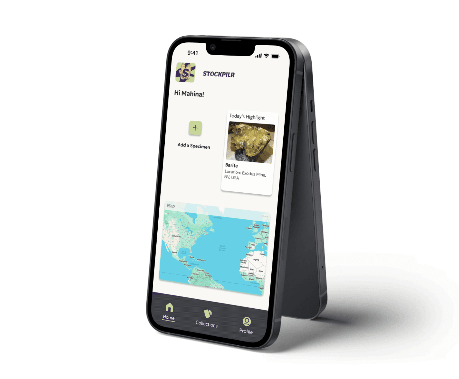
Creating a new way for people to catalog their rock and mineral collections was an essential need for many small time collectors. I validated and tackled this hypothesis using UX research methods, UI design and empathy. From those methods I designed an end to end application called STOCKPILR, a simple and effortless way for collector to keep track of their collections.
Creating a new way for people to catalog their rock and mineral collections was an essential need for many small time collectors. I validated and tackled this hypothesis using UX research methods, UI design and empathy. From those methods I designed an end to end application called STOCKPILR, a simple and effortless way for collector to keep track of their collections.
Creating a new way for people to catalog their rock and mineral collections was an essential need for many small time collectors. I validated and tackled this hypothesis using UX research methods, UI design and empathy. From those methods I designed an end to end application called STOCKPILR, a simple and effortless way for collector to keep track of their collections.


Role: Solo UX/UI Designer
Role: UX/UI Designer
Role: Solo UX/UI Designer
Timeframe: 1 month
Timeframe: 1 month
Timeframe: 1 month
Skills:
Skills:
Skills:
Competitive analysis, user research, usability testing, ui design, branding, accessibility and inclusion, and information architecture
Competitive analysis, user research, usability testing, ui design, branding, accessibility and inclusion, and information architecture
Competitive analysis, user research, usability testing, ui design, branding, accessibility and inclusion, and information architecture
Tools:
Tools:
Tools:
Figma, Figjam, Zoom, Sketching, Fathom AI, Maze
Figma, Figjam, Zoom, Sketching, Fathom AI, Maze
Figma, Figjam, Zoom, Sketching, Fathom AI, Maze
The Context
The Context
The Context
With geology as my first career I am someone who has collected a lot of rocks and minerals over the years but have not found a good consistent way to keep track of them, which means forgetting where some came from thus devaluing them. I was curious if other people had the same issue of keeping track of their collections or if they are just relying on memory like me. If validated, I wanted to create an effortless solution where people could easily catalog their collections on their mobile devices.
With geology as my first career I am someone who has collected a lot of rocks and minerals over the years but have not found a good consistent way to keep track of them, which means forgetting where some came from thus devaluing them. I was curious if other people had the same issue of keeping track of their collections or if they are just relying on memory like me. If validated, I wanted to create an effortless solution where people could easily catalog their collections on their mobile devices.
The Problem
The Problem
The Problem
Many small time collectors are relying on their memory as a catalog for their rock and mineral collections meaning that there is no real catalog of what they have. This becomes an issue when they forget something or start to lose their mental capacity for any reason. However, people continuously rely on their memory because it is quick and easy and feels effortless.
Many small time collectors are relying on their memory as a catalog for their rock and mineral collections meaning that there is no real catalog of what they have. This becomes an issue when they forget something or start to lose their mental capacity for any reason. However, people continuously rely on their memory because it is quick and easy and feels effortless.
The Objective
The Objective
The Objective
I wanted to conduct competitive analysis and user research to better understand why people decided not to catalog their collections as well as understand what tools people were using to catalog and their flaws. Based off of this research, come up with a design that could be tested with users and iterated to address frustrations and expectations.
I wanted to conduct competitive analysis and user research to better understand why people decided not to catalog their collections as well as understand what tools people were using to catalog and their flaws. Based off of this research, come up with a design that could be tested with users and iterated to address frustrations and expectations.
The Solution
The Solution
The Solution
The TL;DR
The TL;DR
The TL;DR
Through user research, competitive analysis and empathy I found that people with rock and mineral collections did not have a good way to catalog their collections. In some cases people were relying solely on memory or physically writing on their specimens. This proved to be troublesome because our memories are not always reliable and pen can easily come off of rocks and minerals. With the information gathered, I created a user persona to further empathize with the user and started to brainstorm features that might be useful in an end to end rock and mineral cataloging application. I developed an app map and user flows to get a better understanding of the information architecture of the app. Then with that I put together low fidelity wireframes and tested them to understand how users interacted with the product. With the feedback gained from those tests and the style tile created, high fidelity wireframes were assembled and I tested again with users. The final usability tests combined had a 90% success rate and people commented that the designed felt clean and intuitive which was my goal.
Through user research, competitive analysis and empathy I found that people with rock and mineral collections did not have a good way to catalog their collections. In some cases people were relying solely on memory or physically writing on their specimens. This proved to be troublesome because our memories are not always reliable and pen can easily come off of rocks and minerals. With the information gathered I created a user persona to further empathize with the user and started to brainstorm features that might be useful in an end to end rock and mineral cataloging application. I developed a site map and user flows to get a better understanding of the information architecture. Then with that low fidelity wireframes were put together and tested to understand how users interacted with the product. with the feedback gained from those tests and the style tile created, high fidelity wireframes were assembled and tested. The final usability tests combined had a 90% success rate and people commented that the designed felt clean and intuitive.
The whole process
The whole process
The whole process
Empathize
Empathize
Empathize
A quick SWOT analysis of the top competitors
A quick SWOT analysis of the top competitors
A quick SWOT analysis of the top competitors
Looking at the competitors by using SWOT analysis allowed me to understand that there is a gap in a mobile experience for collectors. Though collectors can use and do use some of the products listed below there are limitations that may cause them to not want to use them at all.
Looking at the competitors by using SWOT analysis allowed me to understand that there is a gap in a mobile experience for collectors. Though collectors can use and do use some of the products listed below there are limitations that may cause them to not want to use them at all.


User interviews
User interviews
User interviews
I conducted 1 on 1 interviews to gain some qualitative data on how collectors were keeping track of their collections. Through this, I learned that many people are not keeping track of their collections at all and just relying on their memory. After diving a bit more into why people are not cataloguing their collections with the interviewees, I was able to determine that the main reason was because it was too much effort after the specimen had already been collected.
I conducted 1 on 1 interviews to gain some qualitative data on how collectors were keeping track of their collections. Through this, I learned that many people are not keeping track of their collections at all and just relying on their memory. After diving a bit more into why people are not cataloguing their collections with the interviewees, I was able to determine that the main reason was because it was too much effort after the specimen had already been collected.
Affinity mapping
Affinity mapping
Affinity mapping
From the interviews I mapped out common themes together. These ones are the top categories I decided to focus on for this project
From the interviews I mapped out common themes together. These ones are the top categories I decided to focus on for this project
From the interviews I mapped out common themes together. These ones are the top categories I decided to focus on for this project
Cataloguing Method
Does not keep track of collection
-Does not keep track of collection
Weakly catalogues by writing on the rock with a pen
-Weakly catalogues by writing on the rock with a pen
Poorly keeps track of the specimens, mostly by memory
-Poorly keeps track of the specimens, mostly by memory
Uses Google Docs to keep track of specimens
-Uses Google Docs to keep track of specimens
Important details to track
Name of place and what the specimen is
-Name of place and what the specimen is
location
date
metadata
work done on samples
-Location
-Date
-Metadata
-Work done on samples
locality
photo
date collected
context commentary
-Locality
-Photo
-Date collected
-Context commentary
Photo
ID
What it is
Story of where it was found
Date collected
-Photo
-ID
-What it is
-Story of where it was found
-Date collected
Adding to the collection
Adds to the collection annually
no more than 5 specimens
-Adds to the collection annually
-No more than 5 specimens
Prompted to add from seeing something cool or attending gem and mineral show
-Prompted to add from seeing something cool or attending gem and mineral show
Top 3 research findings
Top 3 research findings
Top 3 research findings
There were no consistent methods people used for cataloging their collections and many relied on memory as a catalogue.
The top items people wanted to keep track of were what the specimen collected was and where it was collected as well as associate it with a photo reference.
Collectors are using these random methods to keep track of their collections because they are effortless and easy but worry that when they lose mental capacity or are no longer around all this information will be lost.
Define
Define
Define
POV: I’d like to help users easily and quickly catalogue their rock/mineral collection without too much effort so their collections do not lose their value.
POV: I’d like to help users easily and quickly catalogue their rock/mineral collection without too much effort so their collections do not lose their value.
How Might We create a cataloguing experience that feels effortless for the average rock/mineral collector?
How Might We create a cataloguing experience that feels effortless for the average rock/mineral collector?
User Persona
User Persona
User Persona
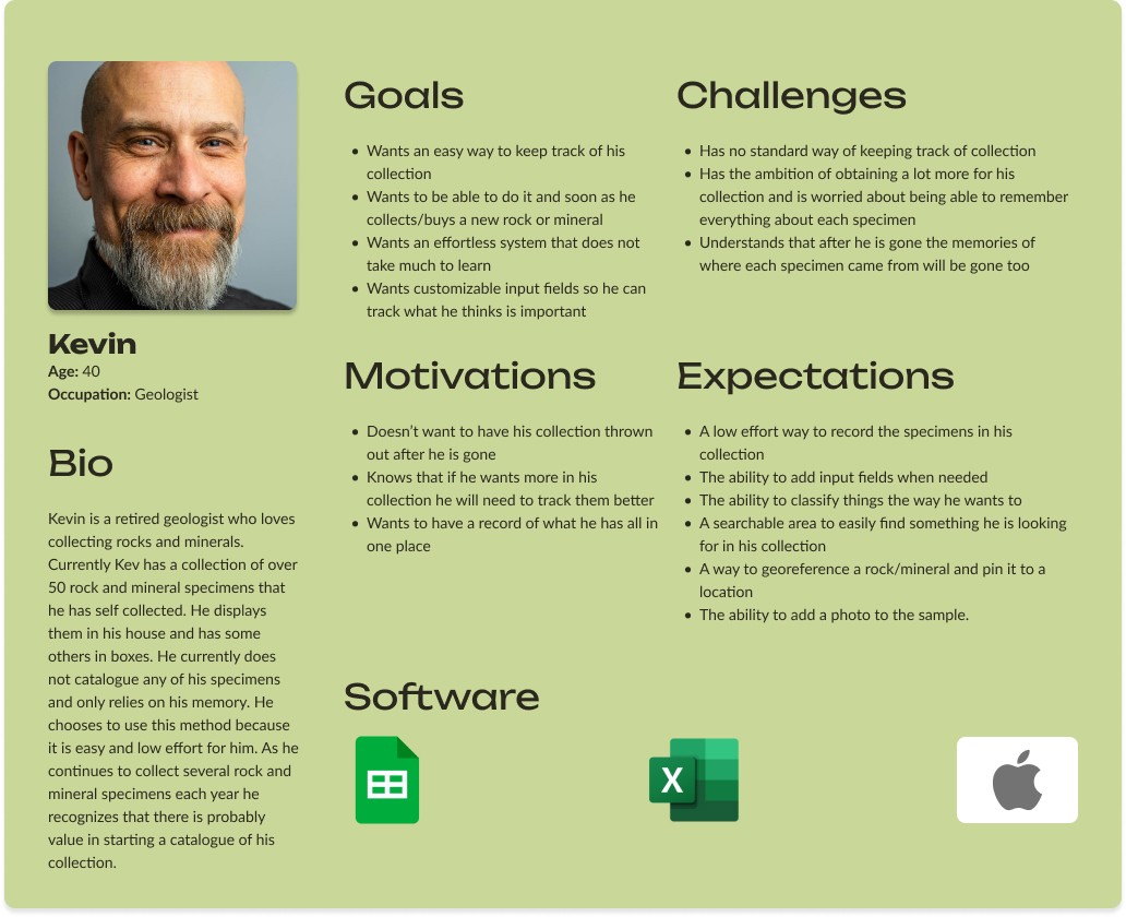
Kevin was created as a mash up of all my interview insights and the top categories of my affinity map. I used him as a reference throughout the creation of Stockpilr to guide me on important design decisions.
Kevin was created as a mash up of all my interview insights and the top categories of my affinity map. I used him as a reference throughout the creation of Stockpilr to guide me on important design decisions.
Kevin was created as a mash up of all my interview insights and the top categories of my affinity map. I used him as a reference throughout the creation of Stockpilr to guide me on important design decisions.


Ideation
Ideation
Ideation
Brainstorming features and prioritization
Brainstorming features and prioritization
Brainstorming features and prioritization
Using the user persona created, I was able to brainstorm features for this MVP and prioritize them based on the research conducted.
Using the user persona created, I was able to brainstorm features for this MVP and prioritize them based on the research conducted.
Using the user persona created, I was able to brainstorm features for this MVP and prioritize them based on the research conducted.


App Map
App Map
App Map
From the top priority features I created a basic app map to understand the basic information architecture and get an idea of how users might move through the app.
From the top priority features I created a basic app map to understand the basic information architecture and get an idea of how users might move through the app.
From the top priority features I created a basic app map to understand the basic information architecture and get an idea of how users might move through the app.


User Flows
User Flows
User Flows
From the app map, prioritized features, and the user persona, I put together 3 user flows to demonstrate and test how a user might complete the most common tasks of the app. The 3 user flows are: 1. Account creation/onboarding, 2. Creating a new collection, and 3. Adding a specimen to a collection. Below you can find 1 of the 3 user flows, setting up a new collection, as well as a link to the full user flow file in figma.
From the app map, prioritized features, and the user persona, I put together 3 user flows to demonstrate and test how a user might complete the most common tasks of the app. The 3 user flows are: 1. Account creation/onboarding, 2. Creating a new collection, and 3. Adding a specimen to a collection. Below you can find 1 of the 3 user flows, setting up a new collection, as well as a link to the full user flow file in figma.


Prototype
Prototype
Prototype
Low-fidelity Prototyping
Low-fidelity Prototyping
Low-fidelity Prototyping
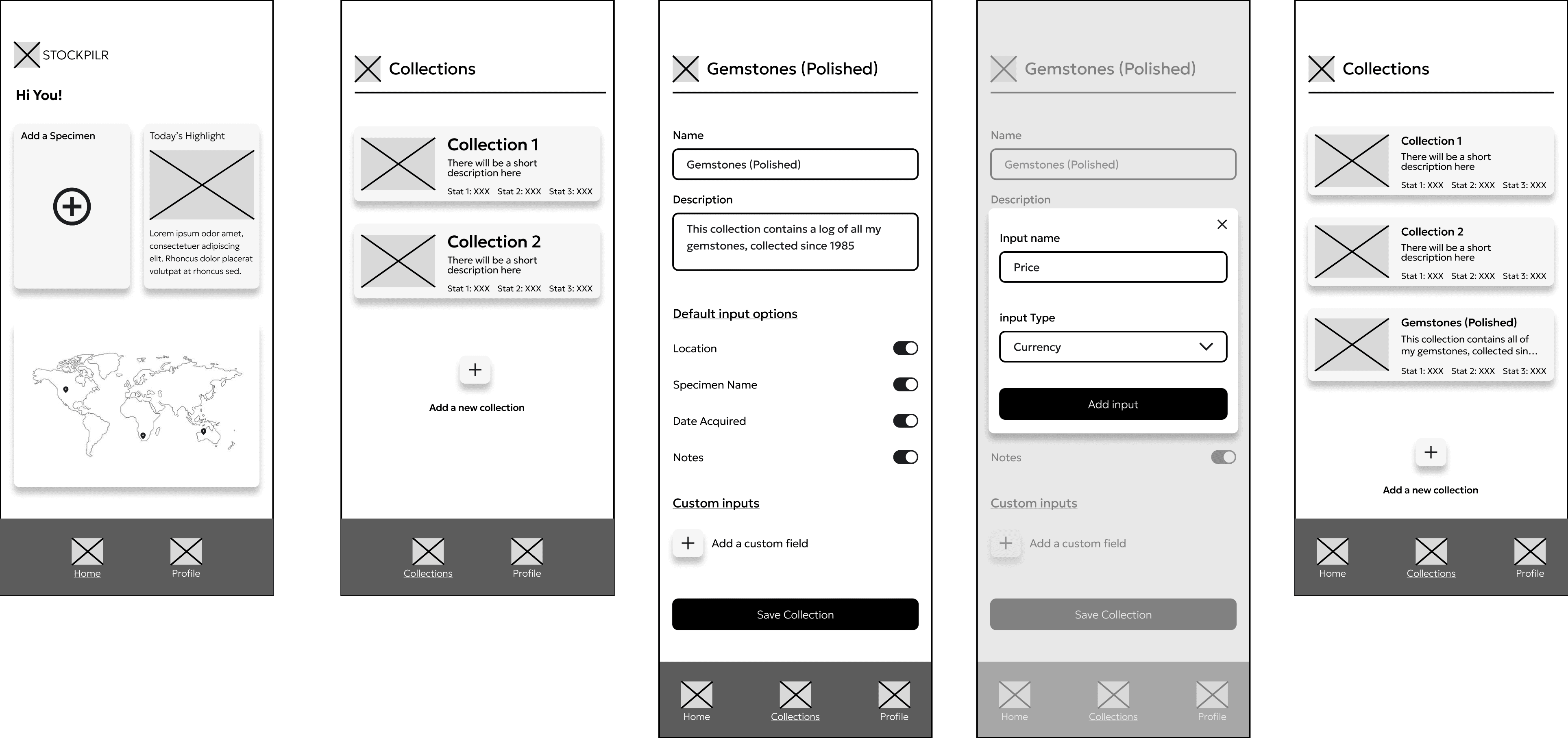
The user flows helped to guide me on what would be integrated into the low fidelity prototypes. These low fidelity screens below are the key screens associated with creating a new collection. The decision was made to deviate a little from the original user flow by not providing templates to use for a collection but having default input options that are the same for every collection and the ability to add custom input fields. This was done to ensure that the interface remained simple and easy to use and learn.
The user flows helped to guide me on what would be integrated into the low fidelity prototypes. These low fidelity screens below are the key screens associated with creating a new collection. The decision was made to deviate a little from the original user flow by not providing templates to use for a collection but having default input options that are the same for every collection and the ability to add custom input fields. This was done to ensure that the interface remained simple and easy to use and learn.

Low-fidelity testing
Low-fidelity testing
Low-fidelity testing
After mocking up all 3 user flows (account creation/onboarding, creating a new collection, and adding a specimen to a collection) I tested them with users. I conducted 1 on 1 usability tests of the three flows over zoom so I could get a better understanding of how users would navigate through the screens. In addition, this was a good way to test the wording and if there was any confusion completing the tasks.
After mocking up all 3 user flows (account creation/onboarding, creating a new collection, and adding a specimen to a collection) I tested them with users. I conducted 1 on 1 usability tests of the three flows over zoom so I could get a better understanding of how users would navigate through the screens. In addition, this was a good way to test the wording and if there was any confusion completing the tasks.
Low-fidelity testing key findings
Low-fidelity testing key findings
Low-fidelity testing key findings
Many people found the word "input" to be confusing when creating a collection
Many people found the word "input" to be confusing when creating a collection
Many people found the word "input" to be confusing when creating a collection
Many people were confused by the example text in the custom input creation area
Many people were confused by the example text in the custom input creation area
Many people were confused by the example text in the custom input creation area
"If there are default options, then why are there toggles for them?"
"If there are default options, then why are there toggles for them?"
"If there are default options, then why are there toggles for them?"
"If you are collecting all over the world then there should be different currency options"
"If you are collecting all over the world then there should be different currency options"
"If you are collecting all over the world then there should be different currency options"
Branding & UI Kit
Branding & UI Kit
Branding & UI Kit
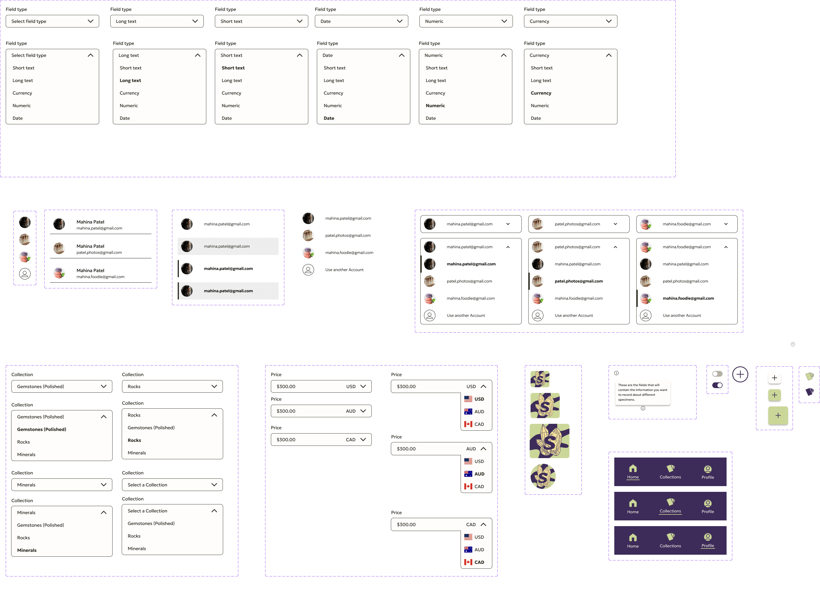
After the low fidelity testing it was time to think about what I wanted STOCKPILR to look like. While picking the colors and designing the logo I kept in mind the brand values that I came up with which were : Effortless, modest and adaptable. I put together a style tile and a UI kit so that I could see how everything worked together and made sure the check the accessibility of the colors so I knew what combinations I could use in the app.
After the low fidelity testing it was time to think about what I wanted STOCKPILR to look like. While picking the colors and designing the logo I kept in mind the brand values that I came up with which were : Effortless, modest and adaptable. I put together this style tile so that I cold see how everything worked together and made sure the check the accessibility of the colors so I knew what combinations I could use in the app.
High-fidelity Prototyping
High-fidelity Prototyping
High-fidelity Prototyping
With the branding done, a name for the app, and the results from the low fidelity usability tests reviewed I put together the first version of some high fidelity wireframes. These wireframes come from each of the 3 user flows and are associated with a set of screens I then used to test with users.
With the branding done, a name for the app, and the results from the low fidelity usability tests reviewed I put together the first version of some high fidelity wireframes. These wireframes come from each of the 3 user flows and are associated with a set of screens I then used to test with users.
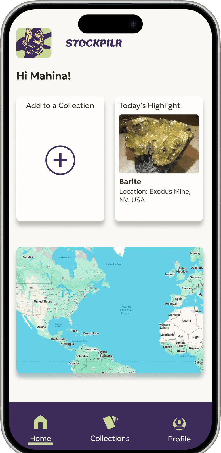

Stockpilr homepage
Stockpilr homepage
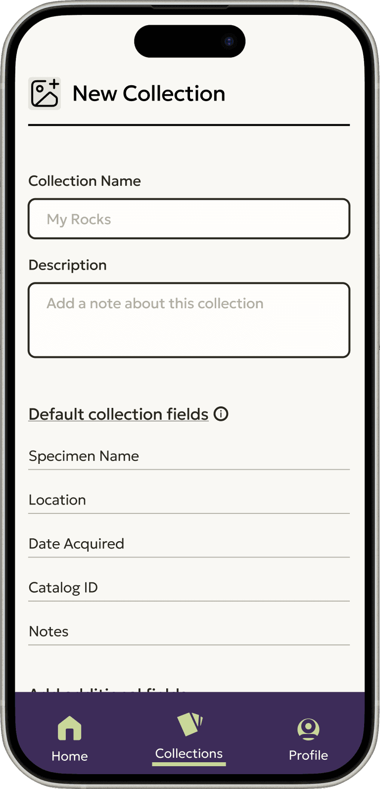

Setup a collection
Setup a collection
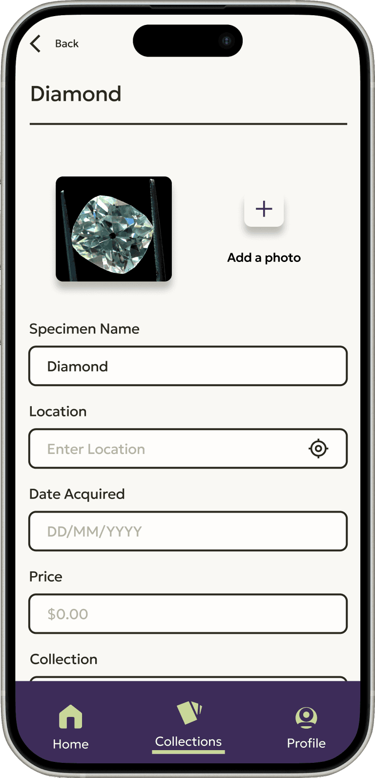

Add a specimen
Add a specimen

Stockpilr homepage

Setup a collection

Add a specimen
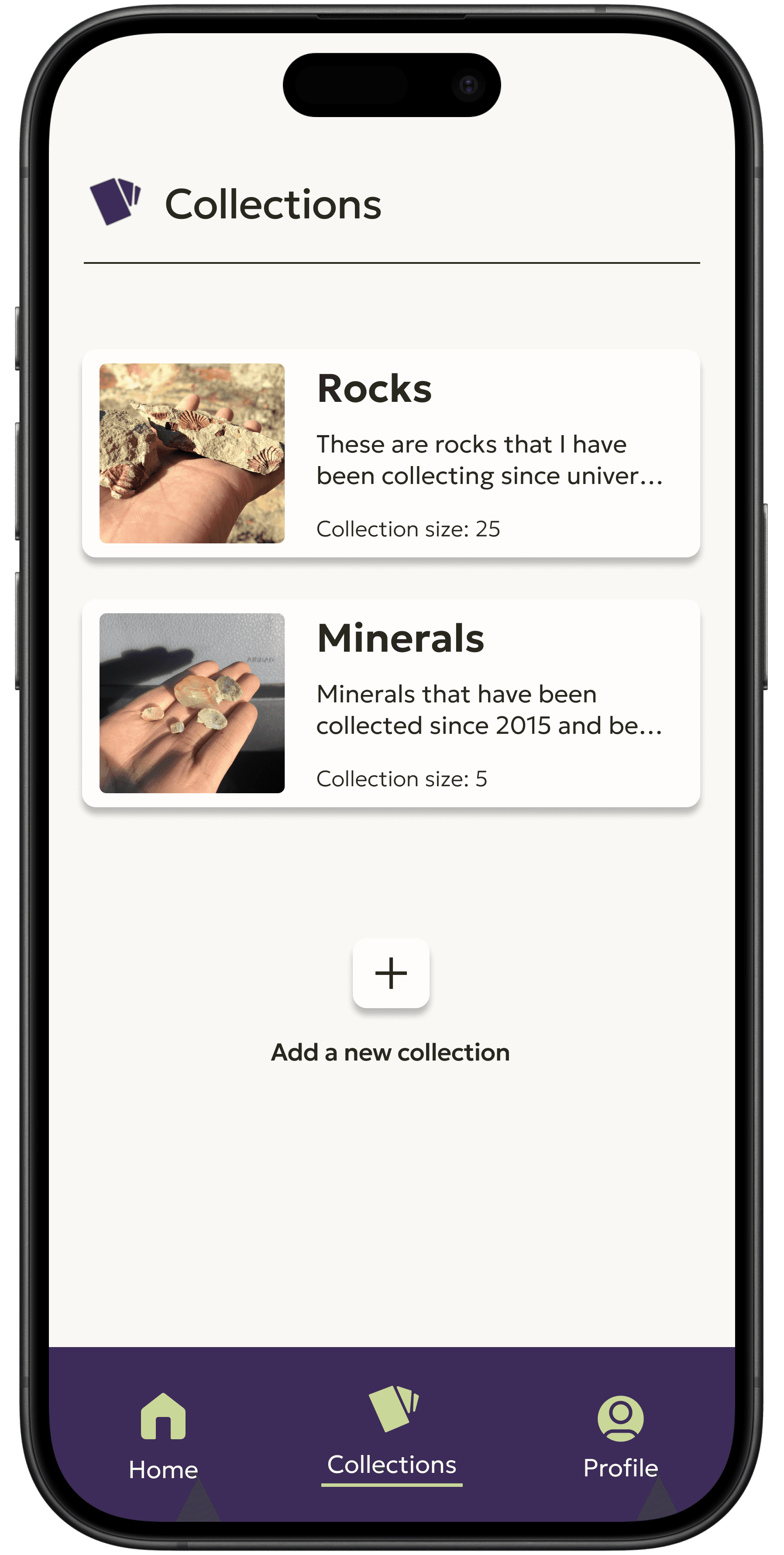
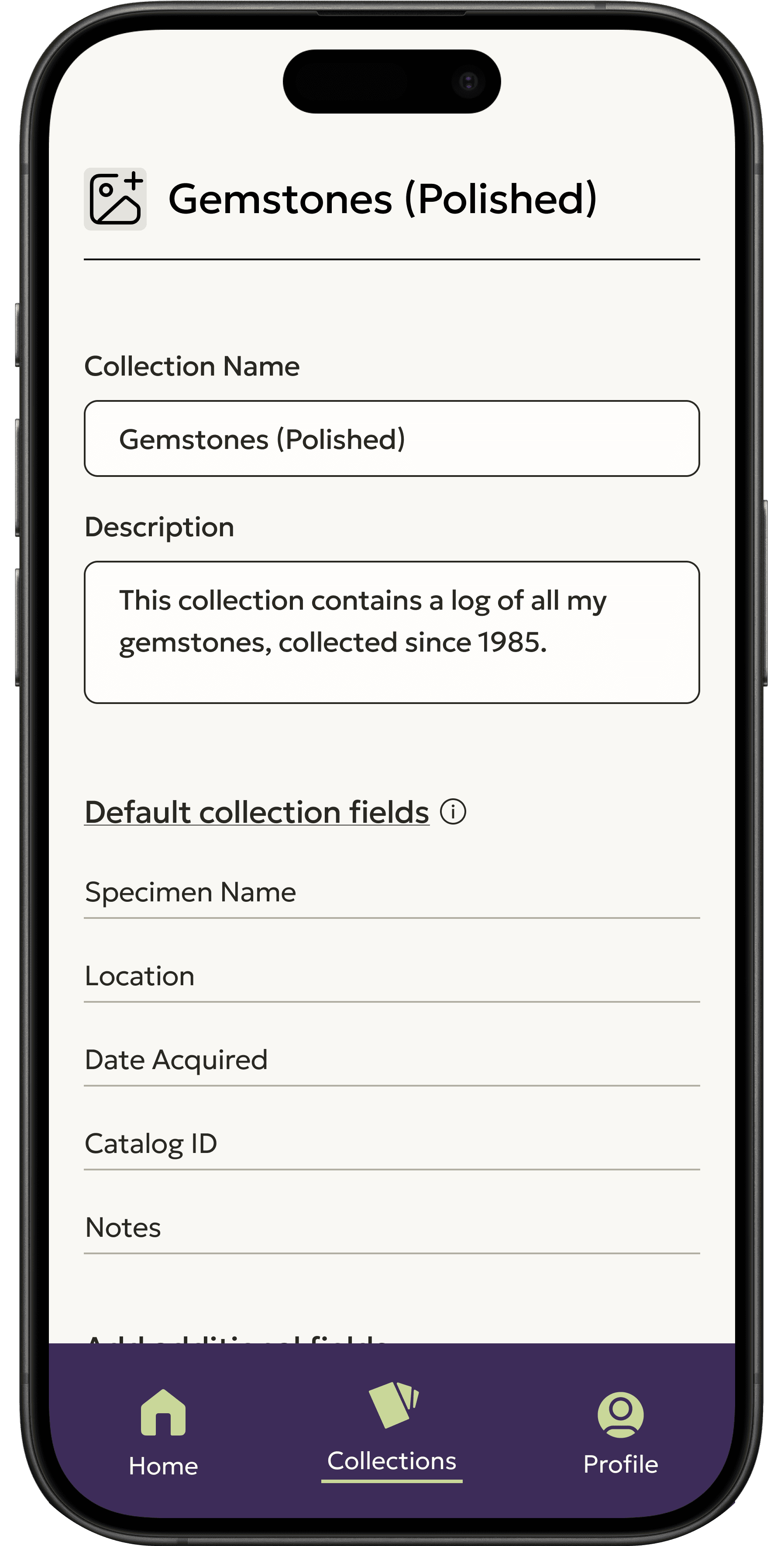
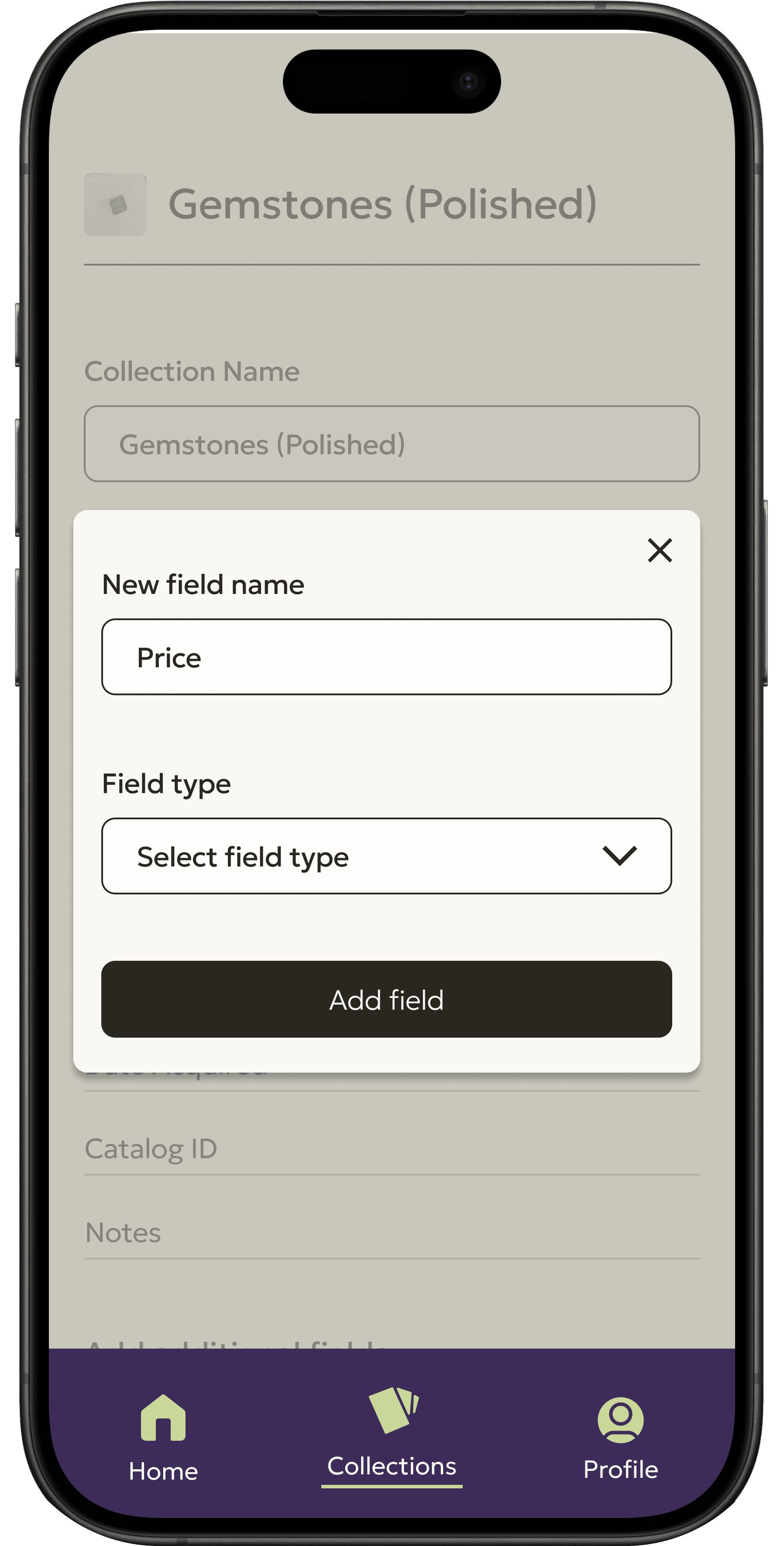
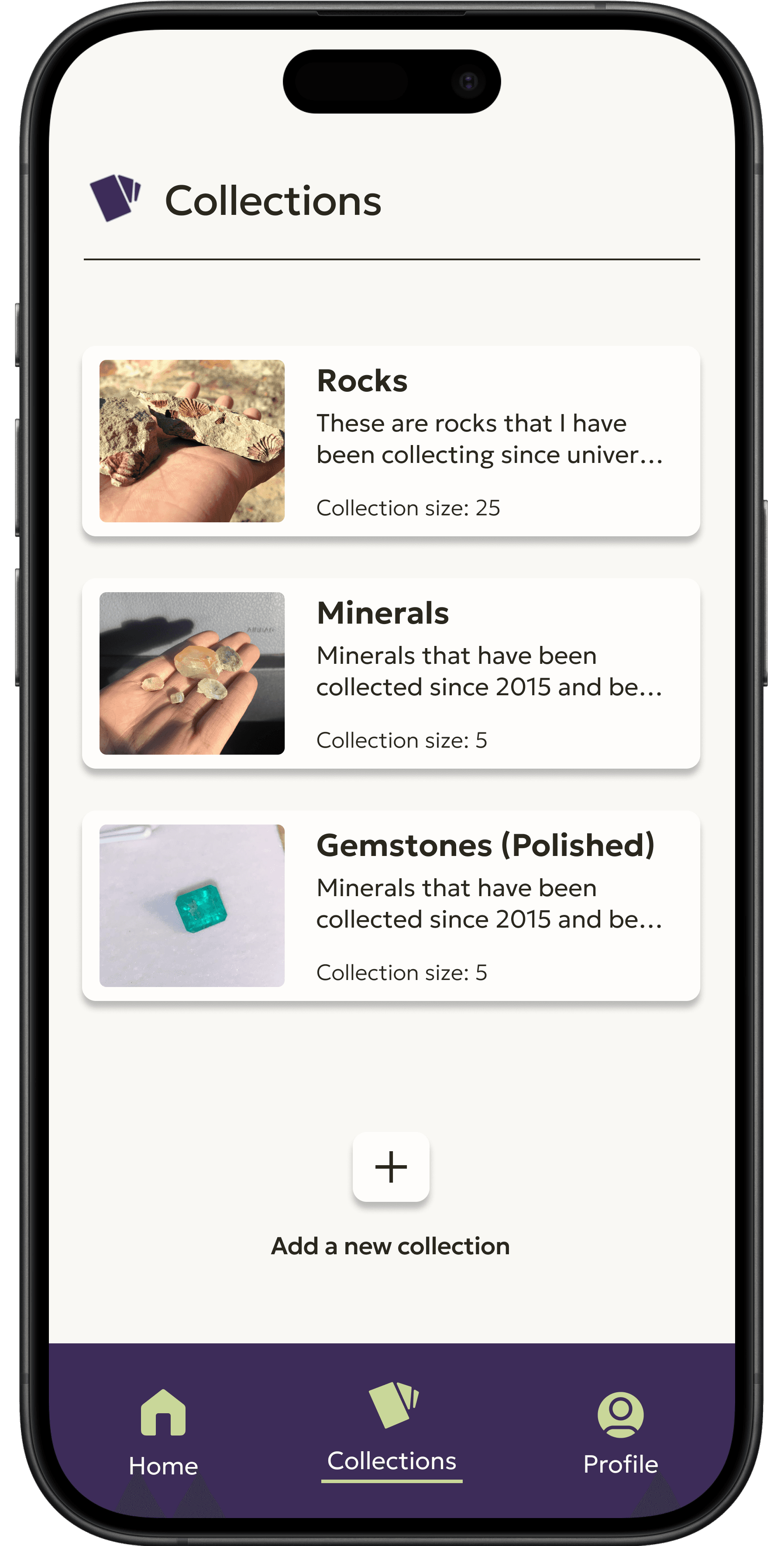
Creating a collection - high fidelity screens
Creating a collection - high fidelity screens
Creating a collection - high fidelity screens
To keep the flow of this case study consistent here are the key version 1 screens from the "set up a collection" flow in order from left to right.
To keep the flow of this case study consistent here are the key version 1 screens from the "set up a collection" flow in order from left to right.
To keep the flow of this case study consistent here are the key version 1 screens from the "set up a collection" flow in order from left to right.
Test
Test
Usability Testing
Usability Testing
I conducted an unmoderated usability test using the version 1 high fidelity prototype with 7 participants on a platform called Maze. I decided to use an unmoderated method to allow participants to remain anonymous as well as complete the tasks without someone watching them, which can be a little stressful. I asked participants to go through each task as if they were using an app on their phone and to provide feedback on each task.
I conducted an unmoderated usability test using the version 1 high fidelity prototype with 7 participants on a platform called Maze. I decided to use an unmoderated method to allow participants to remain anonymous as well as complete the tasks without someone watching them, which can be a little stressful. I asked participants to go through each task as if they were using an app on their phone and to provide feedback on each task.
Key usability testing findings
Key usability testing findings
Task 1: Creating an account
Task 1: Creating an account
There was a 71.4% success rate with one participant leaving the task incomplete because of an internet connectivity issue. The other participant who did not complete the task seems to have just stopped clicking through the tour.
There was a participant who entered their name but not an email or password and just kept clicking “create account” before giving up and doing the Google option.
Several comments from participants were that it felt easy and familiar as well as logical.
The overall ease of use rating for this task was a 3.6/5 ( where 1 is very hard and 5 is very easy).
Task 2: Setting up a collection
Task 2: Setting up a collection
There was a 100% success rate on this task.
The most common error while completing the task was people were clicking “add to a collection” instead of navigating to the collections tab to add a new collection as the wording is very similar.
Many comments stated that the process was straightforward and the UI was clean and user friendly.
The overall ease of use rating was a 4.6/5 ( where 1 is very hard and 5 is very easy).
Task 3: Adding a specimen to a collection
Task 3: Adding a specimen to a collection
There was a 100% success rate on this task.
Most participants opted to use the shortcut on the homepage to add a specimen to a collection.
Participants found this task to be clear and simple as well as easy
Overall participants found all three tasks easy to complete and felt that the navigation was intuitive. In addition someone noted that they wished that there was a bit more branding throughout the prototype.
Iterate
Iterate
Prioritizing revisions
Prioritizing revisions
I wanted to update the next version of the prototype so that users could navigate the three tasks set out for them more easily. Using the feedback and results I got from the high fidelity usability tests I prioritized my revisions so that they would have the most impact for the user. The top 4 priorities are as follows:
I wanted to update the next version of the prototype so that users could navigate the three tasks set out for them more easily. Using the feedback and results I got from the high fidelity usability tests I prioritized my revisions so that they would have the most impact for the user. The top 4 priorities are as follows:
1.
1.
1.
Update the "create and account"flow with some error screens so people can get feedback on why they can't proceed if they are missing information
Update the "create and account"flow with some error screens so people can get feedback on why they can't proceed if they are missing information
Update the "create and account"flow with some error screens so people can get feedback on why they can't proceed if they are missing information
2.
2.
2.
Change the wording of "add to a collection" so it doesn't get confused with adding a collection
Change the wording of "add to a collection" so it doesn't get confused with adding a collection
Change the wording of "add to a collection" so it doesn't get confused with adding a collection
3.
3.
3.
Add more brand colors to the design of the app
Add more brand colors to the design of the app
Add more brand colors to the design of the app
4.
4.
4.
Add a recently created collection to the home page for people to easily access new collections
Add a recently created collection to the home page for people to easily access new collections
Add a recently created collection to the home page for people to easily access new collections
Revisions in action
Revisions in action
Top priority revision
Top priority revision
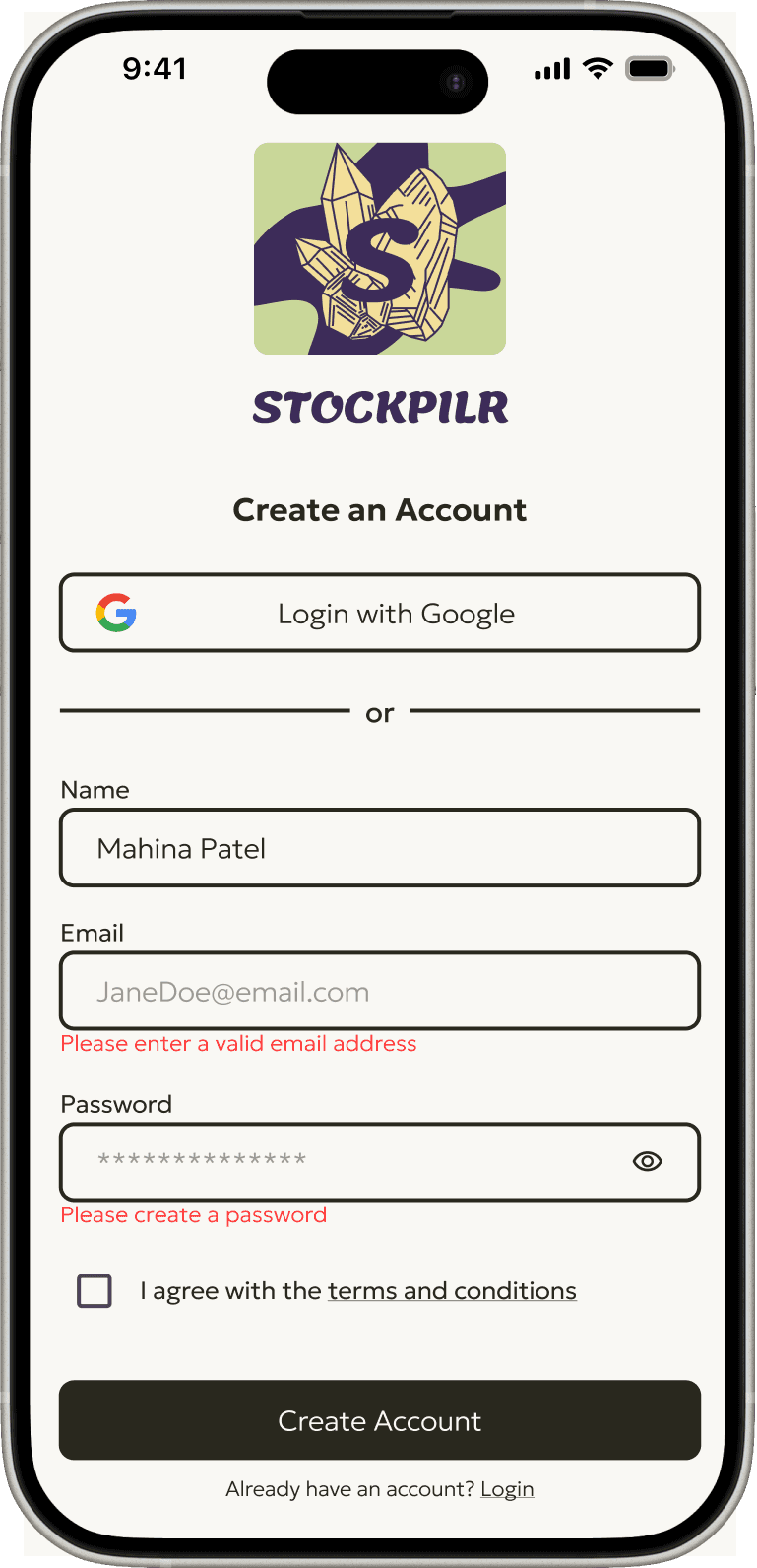
Adding an error screen for the create an account page because it is essential for every user to be able to create an account in order to use the app.
Adding an error screen for the create an account page because it is essential for every user to be able to create an account in order to use the app.


Other priority revisions
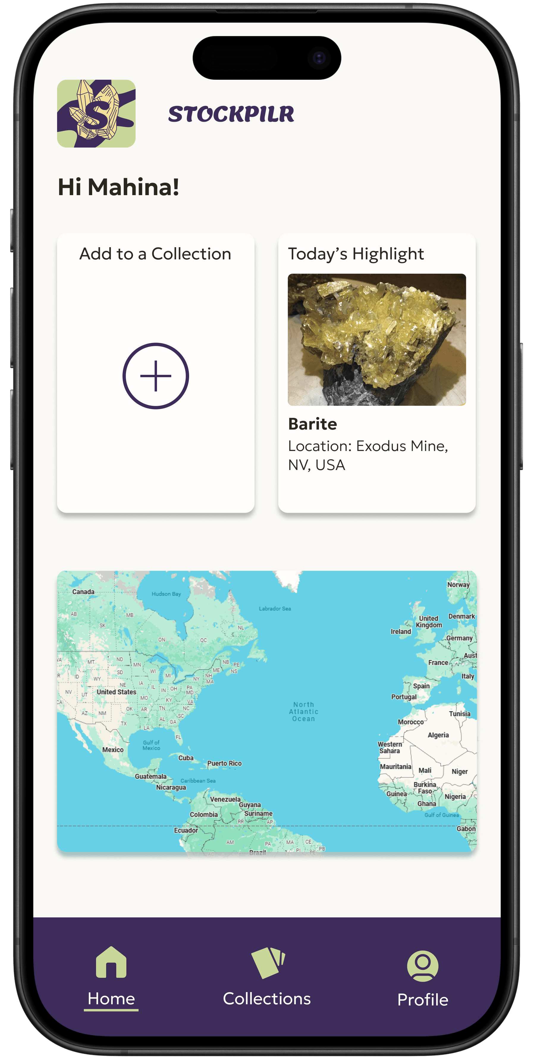
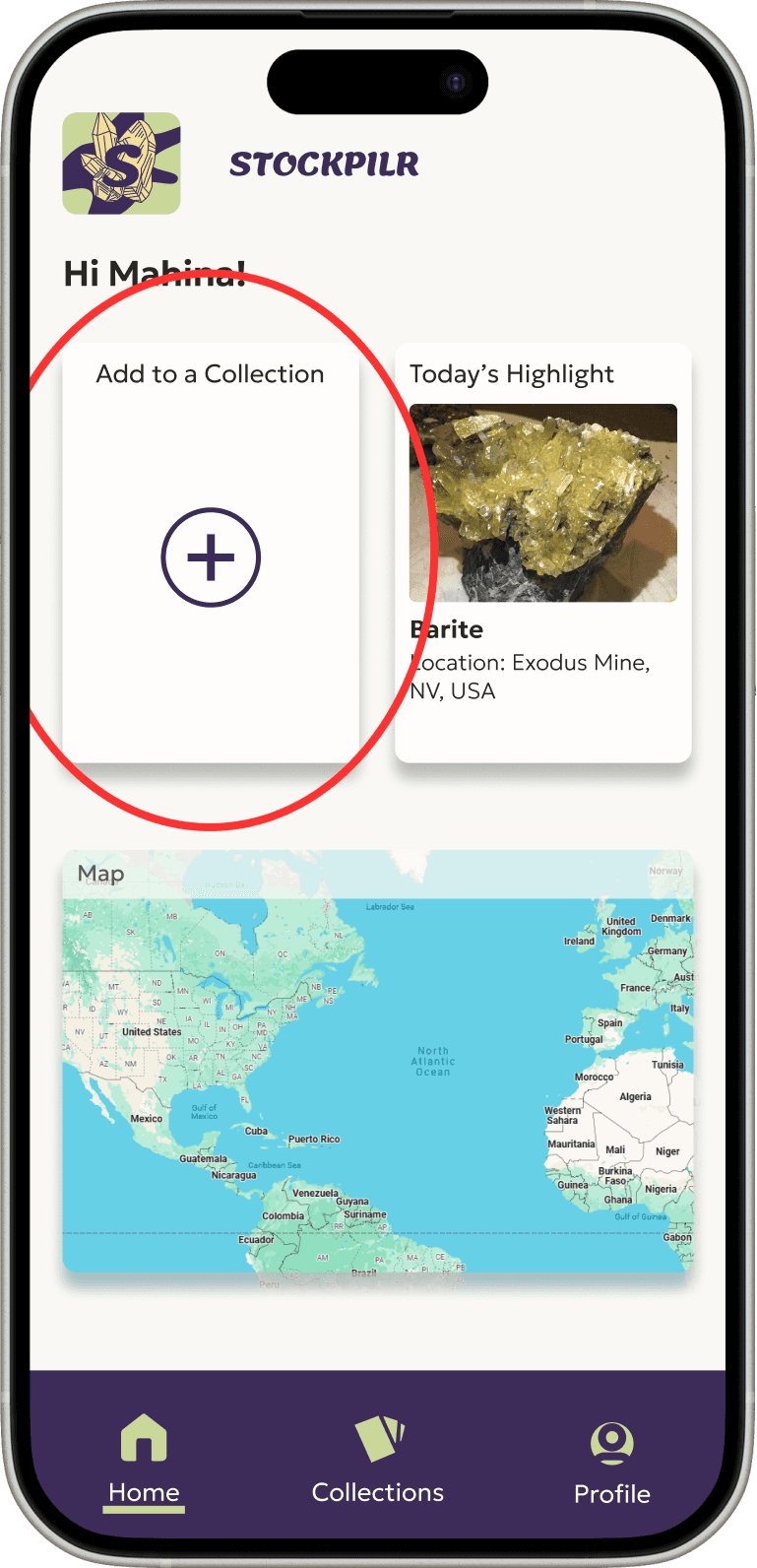
The wording of “add to a collection” was changed to make it more clear on the home screen
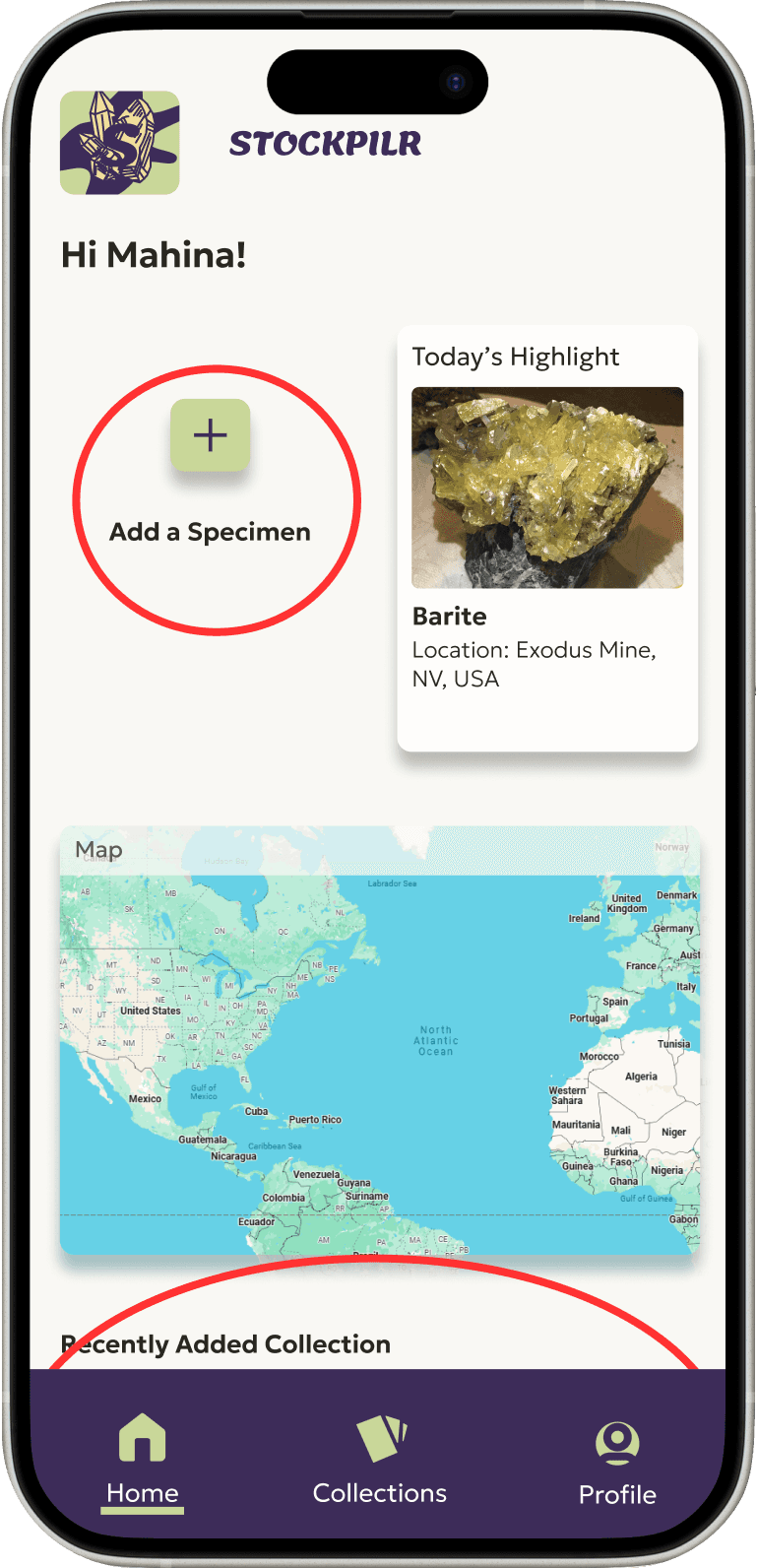
The add buttons were updated with the brand colors to integrate more of the branding
The most recently added collection was added to the homepage to create a shortcut for users to access it.
The wording of “add to a collection” was changed to make it more clear on the home screen
The add buttons were updated with the brand colors to integrate more of the branding
The most recently added collection was added to the homepage to create a shortcut for users to access it.


Version 1
Version 1


Version 2
Version 2
Version 2 of the 'Create a collection' flow
Version 2 of the 'Create a collection' flow
Learnings & next steps
Learnings & next steps
Key learnings
Key learnings
Asking people their opinions on color, design and general usability outside of usability testing was helpful.
Testing in the low fidelity stage made it a lot easier to update and add things that people wanted or were confused by.
People do not read, they skim. This made wording choices essential for this product.
Validate your assumptions and ideas and it is okay if things evolve away from what you initially thought as long as you are creating something that is addressing the users issues.
Next steps & future aspirations
Next steps & future aspirations
Add a feature where users can add specimens from the map.
Create a desktop version and allow for csv importing and exporting to cater to user who have catalogued their collections in excel or google docs.
Implement a quick add feature where people can quickly add custom fields while creating a collection that they have added before with other collections.
Add an area where people can nominate a person to inherit their collection and view all the data associated with it.
And so much more :)
Get in touch at emma.tulsky@gmail.com
©2024 Emma Tulsky, All rights reserved
Get in touch at emma.tulsky@gmail.com
©2024 Emma Tulsky, All rights reserved
Get in touch at emma.tulsky@gmail.com
©2024 Emma Tulsky, All rights reserved


