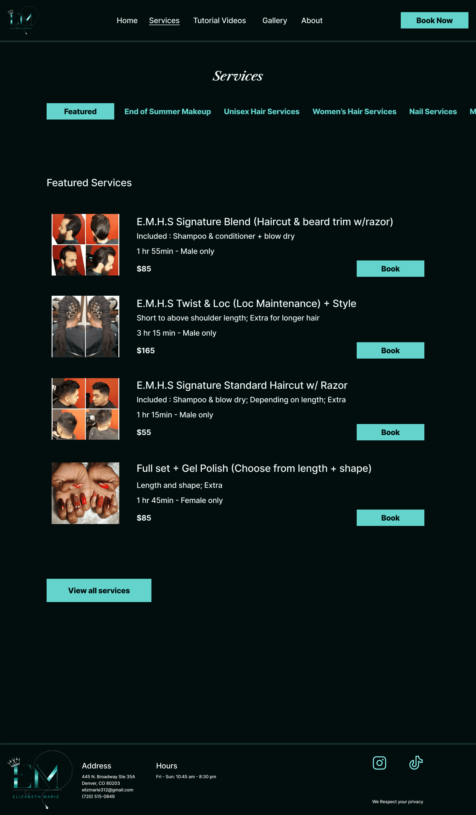
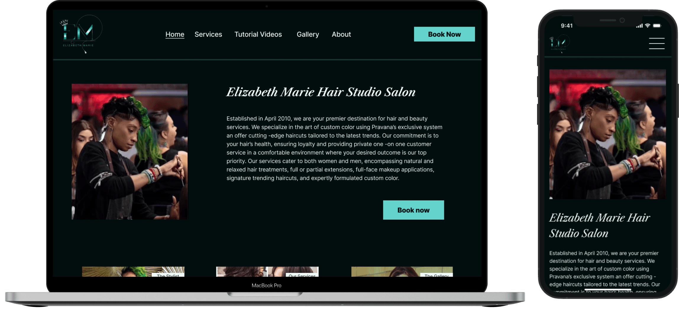
Elizabeth Marie Hair Studio responsive design
Elizabeth Marie Hair Studio responsive design
Increasing the knowlege of services offered at Elizabeth Marie Hair Studio. Creating an intuitive and accessible responsive website for a local stylist trying to grow her business.


Role: UX/UI Designer
Timeframe: 1 month
Skills:
Competitive analysis, user research, usability testing, ui design, branding, accessibility and inclusion, and information architecture
Tools:
Figma, Figjam, Zoom, wireframe sketching
The Context
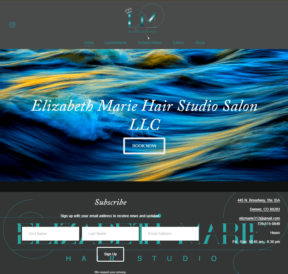
Elizabeth Marie Hair Salon (EMHS) is a local hair salon in the Denver, CO area. I approached the salon owner about a redesign with the intent of improving accessibility. After further investigating her website I found that people could only access the Services if they clicked “book now”. I suspected this was hindering her ability to gain more clients so I decided to look into what people usually look for on a salon’s website and what is important to them.
Elizabeth Marie Hair Salon (EMHS) is a local hair salon in the Denver, CO area. I approached the salon owner about a redesign with the intent of improving accessibility. After further investigating her website I found that people could only access the Services if they clicked “book now”. I suspected this was hindering her ability to gain more clients so I decided to look into what people usually look for on a salon’s website and what is important to them.
The Problem
When people are looking for a hair salon it is often a stressful process and if they don’t find a site easy to use with the information they are looking for they may move on to the next salon’s website. This is a problem for a stylist who is trying to grow their business because they potentially losing clients that would enjoy their services.
When people are looking for a hair salon it is often a stressful process and if they don’t find a site easy to use with the information they are looking for they may move on to the next salon’s website. This is a problem for a stylist who is trying to grow their business because they potentially losing clients that would enjoy their services.
The Objective
Through user interviews, empathy and secondary research I wanted to understand what it is that people are looking for in a salon’s website and what they value most. With that information, I would then be able to improve the EMHS website design and address what might be missing so that it is caters to user’s expectations.
Through user interviews, empathy and secondary research I wanted to understand what it is that people are looking for in a salon’s website and what they value most. With that information, I would then be able to improve the EMHS website design and address what might be missing so that it is caters to user’s expectations.
The Solution
The TL;DR
The TL;DR
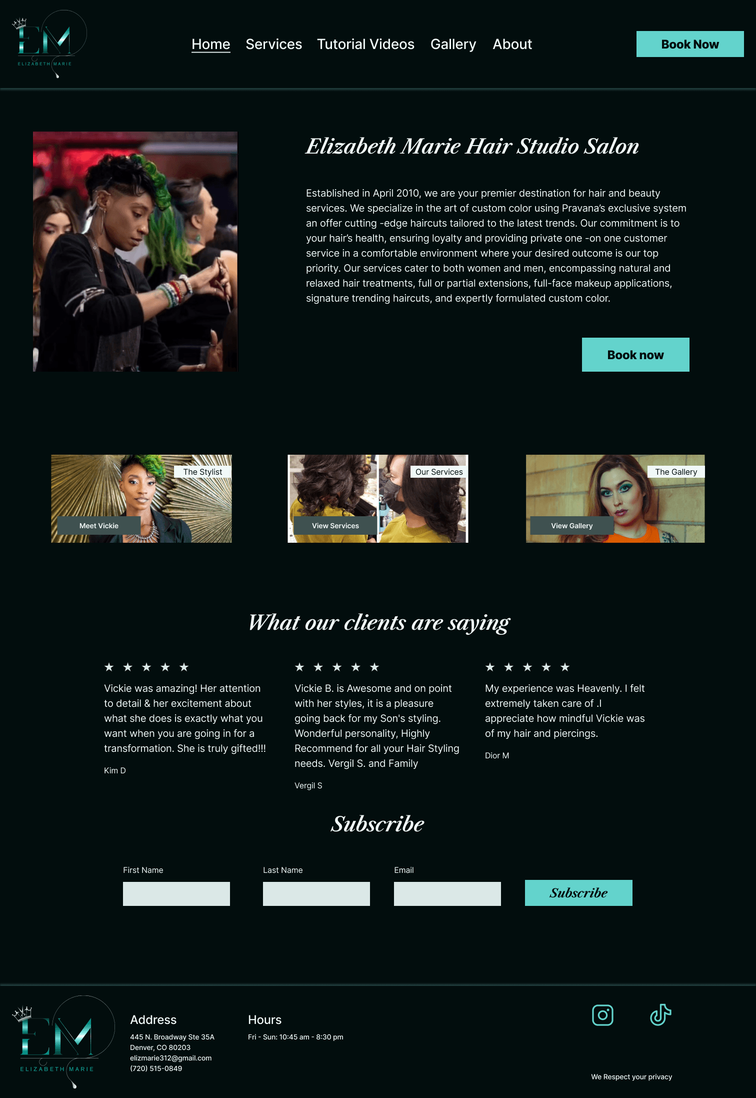
Through competitive analysis and user research I discovered that people become quite stressed while looking for a new hair stylist. The qualitative data I received through user research further confirmed my initial thought that people wanted to be able to view the services and their prices without having to click a ‘book now’ button. With that information, I developed a feature set focused on user goals and came up with a user flow for people who might be navigating through the site to see if this is the right salon for them. After the information architecture was in place I put together low and mid fidelity wireframes for testing. Once the testing was completed I implemented the feedback into high fidelity wireframes and tested them again with users. After that round of testing, with a 100% task completion rate, I iterated again on some confusion with wording and accessibility issues. I sent the final designs to the client and she indicated she would like to talk more about implementing the designs.
Through competitive analysis and user research I discovered that people become quite stressed while looking for a new hair stylist. The qualitative data I received through user research further confirmed my initial thought that people wanted to be able to view the services and their prices without having to click a ‘book now’ button. With that information, I developed a feature set focused on user goals and came up with a user flow for people who might be navigating through the site to see if this is the right salon for them. After the information architecture was in place I put together low and mid fidelity wireframes for testing. Once the testing was completed I implemented the feedback into high fidelity wireframes and tested them again with users. After that round of testing, with a 100% task completion rate, I iterated again on some confusion with wording and accessibility issues. I sent the final designs to the client and she indicated she would like to talk more about implementing the designs.
Original Site Design
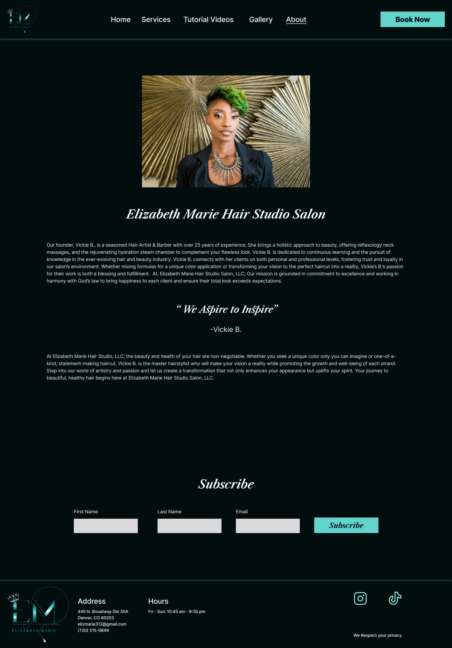
New Site Design
Original Site Design


New Site Design


The whole process
The whole process
Empathize
What are other salons in the area doing?
What are other salons in the area doing?
I wanted to check out what salons in the Denver area were putting on their sites and how they were marketing themselves to get a sense of the competition. This gave me a better understanding of what is expected from a salon’s website in the area. This also showed me what opportunities I could take advantage of in this redesign.
I wanted to check out what salons in the Denver area were putting on their sites and how they were marketing themselves to get a sense of the competition. This gave me a better understanding of what is expected from a salon’s website in the area. This also showed me what opportunities I could take advantage of in this redesign.


User interviews
User interviews
After conducting the competitive analysis I wanted to talk with people who had recently had the experience of looking for a hair salon. I held 1 on 1 interviews with people of all hair types to be sure I was able to understand what people value most when looking for a salon. The gathering of this qualitative research allowed me to better empathize with people looking for a salon and try to cater my design decisions to address what real people were actually looking for.
After conducting the competitive analysis I wanted to talk with people who had recently had the experience of looking for a hair salon. I held 1 on 1 interviews with people of all hair types to be sure I was able to understand what people value most when looking for a salon. The gathering of this qualitative research allowed me to better empathize with people looking for a salon and try to cater my design decisions to address what real people were actually looking for.
Top 3 interview findings
Top 3 interview findings
All people, no matter their hair type really valued being able to look at the services and prices before commiting to book
All people, no matter their hair type really valued being able to look at the services and prices before commiting to book
Many people felt stress or anxiety when looking for a salon because it is a new relationship you are building
Many people felt stress or anxiety when looking for a salon because it is a new relationship you are building
People valued a clean and easy to navigate site with photos and a welcoming vibe so that they could get a sense of whether it was the place for them
People valued a clean and easy to navigate site with photos and a welcoming vibe so that they could get a sense of whether it was the place for them
Empathy map
Empathy map
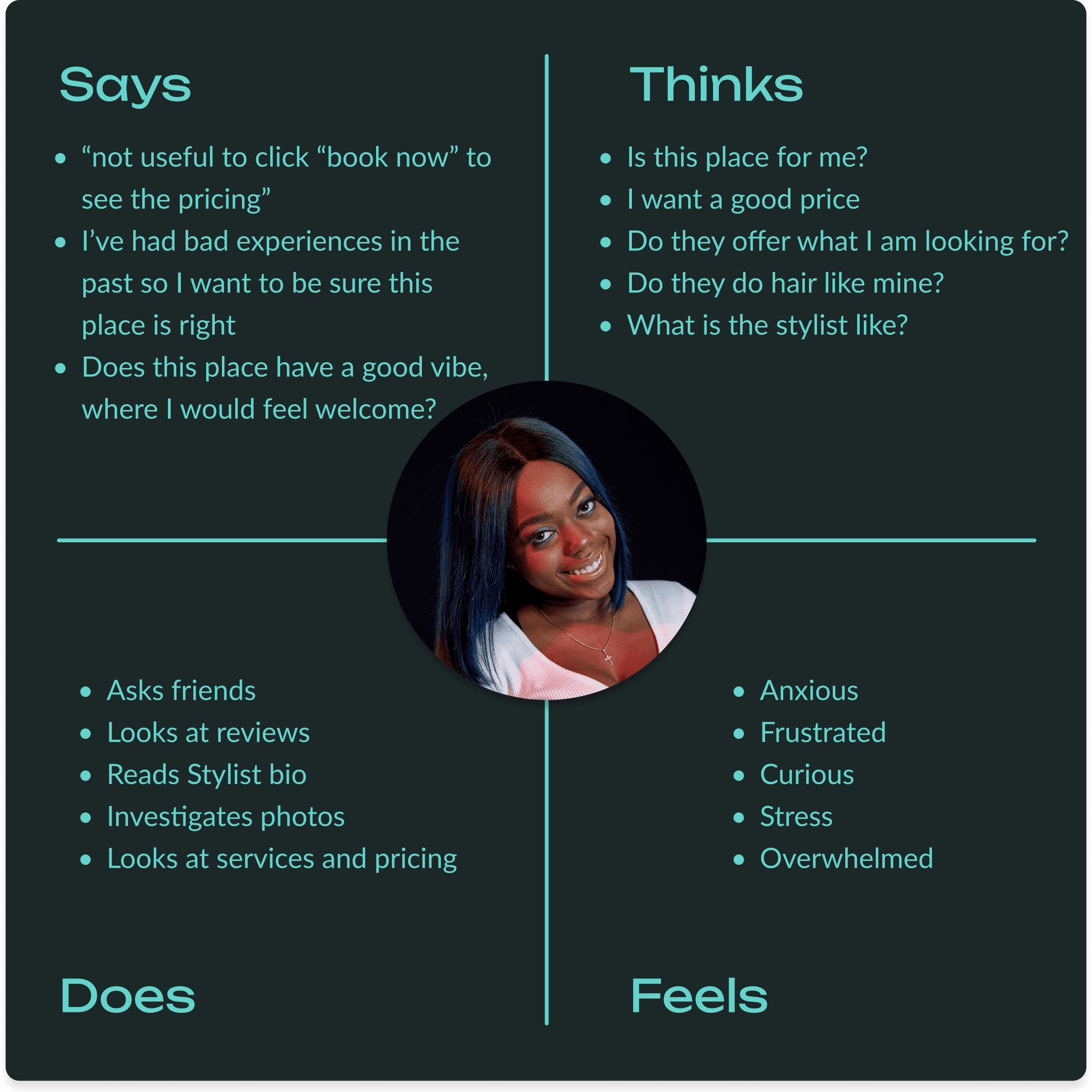
Using the interview responses, I put together an empathy map so that I had a general idea of what users were experiencing when looking for a salon. This is what I would use to help me make design decisions in the future and define the problem
Using the interview responses, I put together an empathy map so that I had a general idea of what users were experiencing when looking for a salon. This is what I would use to help me make design decisions in the future and define the problem


Define
With all the research findings and empathy map created I felt comfortable taking a stab at what the EMHS salon site was missing by defining a problem and How Might We statement.
With all the research findings and empathy map created I felt comfortable taking a stab at what the EMHS salon site was missing by defining a problem and How Might We statement.
Problem Statement: Many people feel anxiety when looking for a new salon and would probably navigate away from the EMHS site because the services aren’t easily accessible and it takes a bit of effort to view them.
Problem Statement: Many people feel anxiety when looking for a new salon and would probably navigate away from the EMHS site because the services aren’t easily accessible and it takes a bit of effort to view them.
HMW: How might we help users feel more comfortable when looking to book a service at the EMHS salon?
HMW: How might we help users feel more comfortable when looking to book a service at the EMHS salon?
Ideation
Brainstorming features and prioritization
Brainstorming features and prioritization
Using the interview findings, competitive analysis, and the empathy map, I was able to come up with some features for the EMHS redesign. Due to time constraints I chose to focus my efforts on the P1 features for this project as those features are addressing the top issues.
Using the interview findings, competitive analysis, and the empathy map, I was able to come up with some features for the EMHS redesign. Due to time constraints I chose to focus my efforts on the P1 features for this project as those features are addressing the top issues.


User Flows
User Flows
Using the priority features I came up with a user flow for booking a hair service. This was useful for me to visualize how users might move through the site based on their preferences and what they look at when browsing a salon’s website.
Using the priority features I came up with a user flow for booking a hair service. This was useful for me to visualize how users might move through the site based on their preferences and what they look at when browsing a salon’s website.


Prototype
Prototype
Low-fidelity wireframes
Low-fidelity wireframes
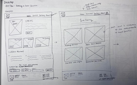
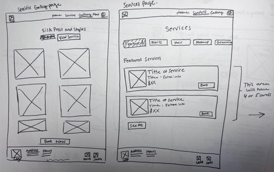
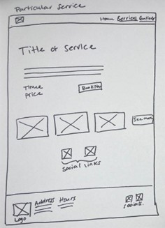
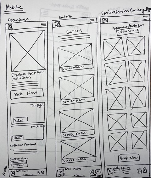
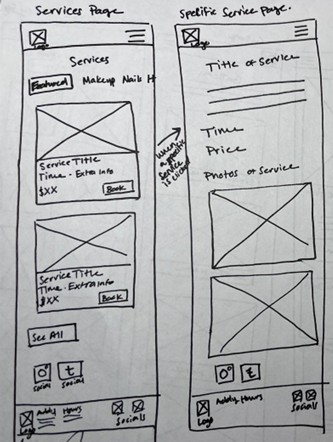
Once I had the user flow, features, and problem defined it was time for me to go to the drawing board and sketch out my ideas. I am a big fan of sketching because it really gives you the freedom to just focus on the design and nothing else. Additionally, it is versatile and quick so you can get a visual of what you might expect the site to look like before opening any design software.
Once I had the user flow, features, and problem defined it was time for me to go to the drawing board and sketch out my ideas. I am a big fan of sketching because it really gives you the freedom to just focus on the design and nothing else. Additionally, it is versatile and quick so you can get a visual of what you might expect the site to look like before opening any design software.
Desktop low-fidelity sketches
Desktop low-fidelity sketches
Mobile low-fidelity sketches
Mobile low-fidelity sketches
Mid-fidelity wireframes
Mid-fidelity wireframes
For this project I wanted to put together some mid-fidelity wireframes to test. These wireframes were built in Figma and I tried to make them similar to the ideas in the sketching but ultimately things never work out perfectly. There were some changes that were made for the mid-fidelity wireframes to optimize ease of use.
For this project I wanted to put together some mid-fidelity wireframes to test. These wireframes were built in Figma and I tried to make them similar to the ideas in the sketching but ultimately things never work out perfectly. There were some changes that were made for the mid-fidelity wireframes to optimize ease of use.
Mid-fidelity usability testing
Mid-fidelity usability testing
I conducted mid-fidelity testing for a single flow within the EMHS design. Each test was completed by asking users to navigate through the site, viewing the gallery and then navigating to the services to book a particular service. All tests were done through the Figma prototyping tool with the mobile version and a desktop version and users were on zoom sharing their screens so that I could ask them questions when the task was completed. The main purpose of this testing was to understand how people would navigate the site and their opinions on it.
I conducted mid-fidelity testing for a single flow within the EMHS design. Each test was completed by asking users to navigate through the site, viewing the gallery and then navigating to the services to book a particular service. All tests were done through the Figma prototyping tool with the mobile version and a desktop version and users were on zoom sharing their screens so that I could ask them questions when the task was completed. The main purpose of this testing was to understand how people would navigate the site and their opinions on it.
Top mid-fidelity test results
Top mid-fidelity test results
Top mid-fidelity test results
100%
100%
of people completed the task
of people completed the task
of people completed the task
There was some confusion/frustration when the top mobile menu did not close when a page was selected
Several people wanted to see a ‘book now’ or ‘view services’ button at the bottom of the gallery page
Overall people rated the task as a 5 for ease of use ( where 1 was very hard and 5 was very easy)
High-fidelity Prototyping
High-fidelity Prototyping
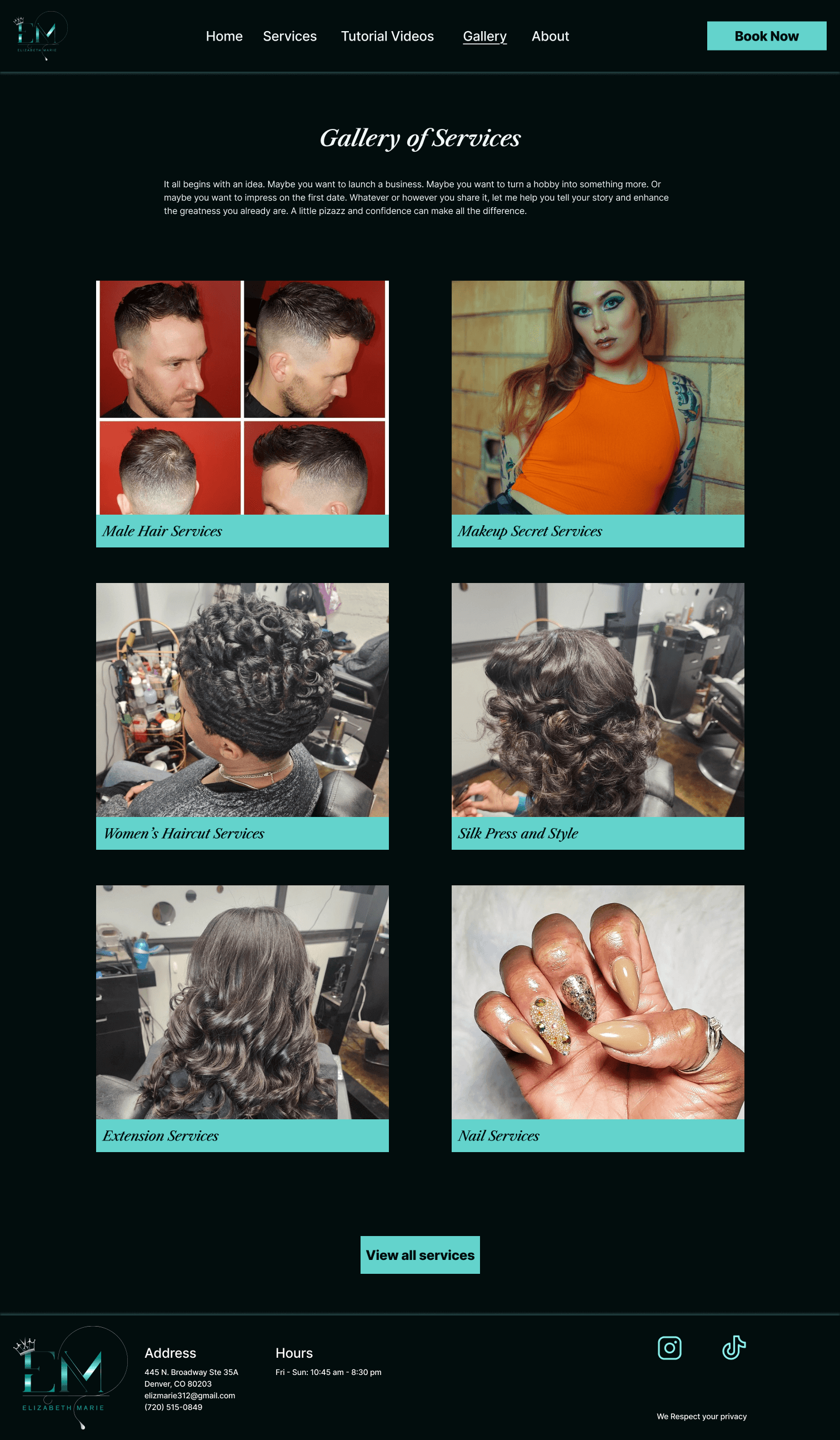
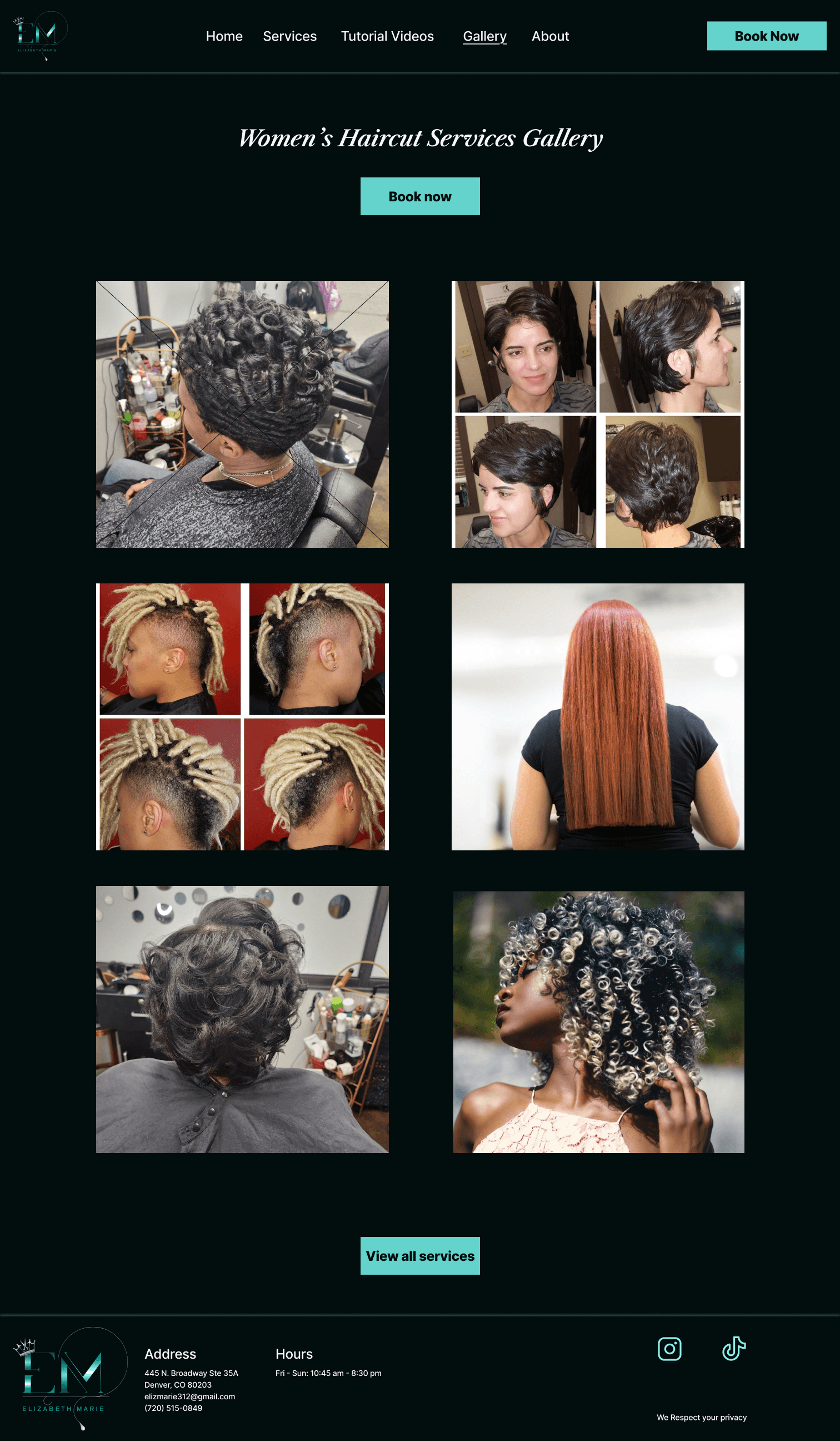
The next step was to use the feedback I received from the participants in the mid-fidelity usability testing to put together some high fidelity screens and prototype them for testing. These screens were in both desktop and mobile format as those are the main formats that people seem to view the EMHS website on.
The next step was to use the feedback I received from the participants in the mid-fidelity usability testing to put together some high fidelity screens and prototype them for testing. These screens were in both desktop and mobile format as those are the main formats that people seem to view the EMHS website on.
Desktop HiFi screens - version 1
Desktop HiFi screens - version 1
Mobile HiFi screens - version 1
Mobile HiFi screens - version 1
Test
Usability Testing
Usability Testing
After putting together some high fidelity screens and prototyping them out I needed to test them on users. My main goal with this usability testing was to obtain feedback about the general flow of the designs and the look and feel. I conducted 1 on 1 in person tests so see how people would navigate through the site on both mobile and desktop.
After putting together some high fidelity screens and prototyping them out I needed to test them on users. My main goal with this usability testing was to obtain feedback about the general flow of the designs and the look and feel. I conducted 1 on 1 in person tests so see how people would navigate through the site on both mobile and desktop.
Task : From the Homepage, navigate to the gallery to view women’s hair services and then book a trendy haircut.
Task : From the Homepage, navigate to the gallery to view women’s hair services and then book a trendy haircut.
Key usability testing findings
Key usability testing findings
Desktop:
Several people found the text to be too small as well as the logo
A couple people did not like the black and white photo on the homepage and how it made them feel
Some people mentioned it was confusing to have the word services in the gallery
All found the flow to be easy to navigate
Desktop:
Several people found the text to be too small as well as the logo
A couple people did not like the black and white photo on the homepage and how it made them feel
Some people mentioned it was confusing to have the word services in the gallery
All found the flow to be easy to navigate
Mobile:
Felt the mobile version was better than the desktop version
A lot of users felt there was too much scrolling the on the services page and did not see the shortcut menu
All people found the mobile version to be intuitive and the interaction to be smoother than the desktop version.
Mobile:
Felt the mobile version was better than the desktop version
A lot of users felt there was too much scrolling the on the services page and did not see the shortcut menu
All people found the mobile version to be intuitive and the interaction to be smoother than the desktop version.
100 % of participants completed the task successfully
100 % of participants completed the task successfully
4.8/5 Overall ease of use rating from 5 participants
4.8/5 Overall ease of use rating from 5 participants
Iterate
Prioritizing revisions
Prioritizing revisions
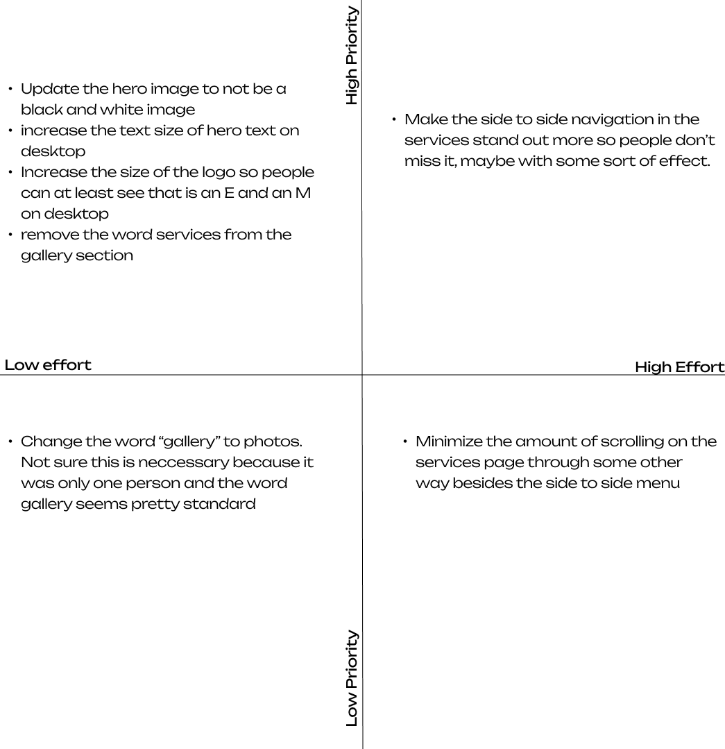
In order prioritize the iterations I was going to make, I wanted to use a priority matrix. I found this method to be helpful because it allowed me to take care of the easy and high value iterations quickly as this project was under a time constraint.
In order prioritize the iterations I was going to make, I wanted to use a priority matrix. I found this method to be helpful because it allowed me to take care of the easy and high value iterations quickly as this project was under a time constraint.


Revisions in action
Revisions in action
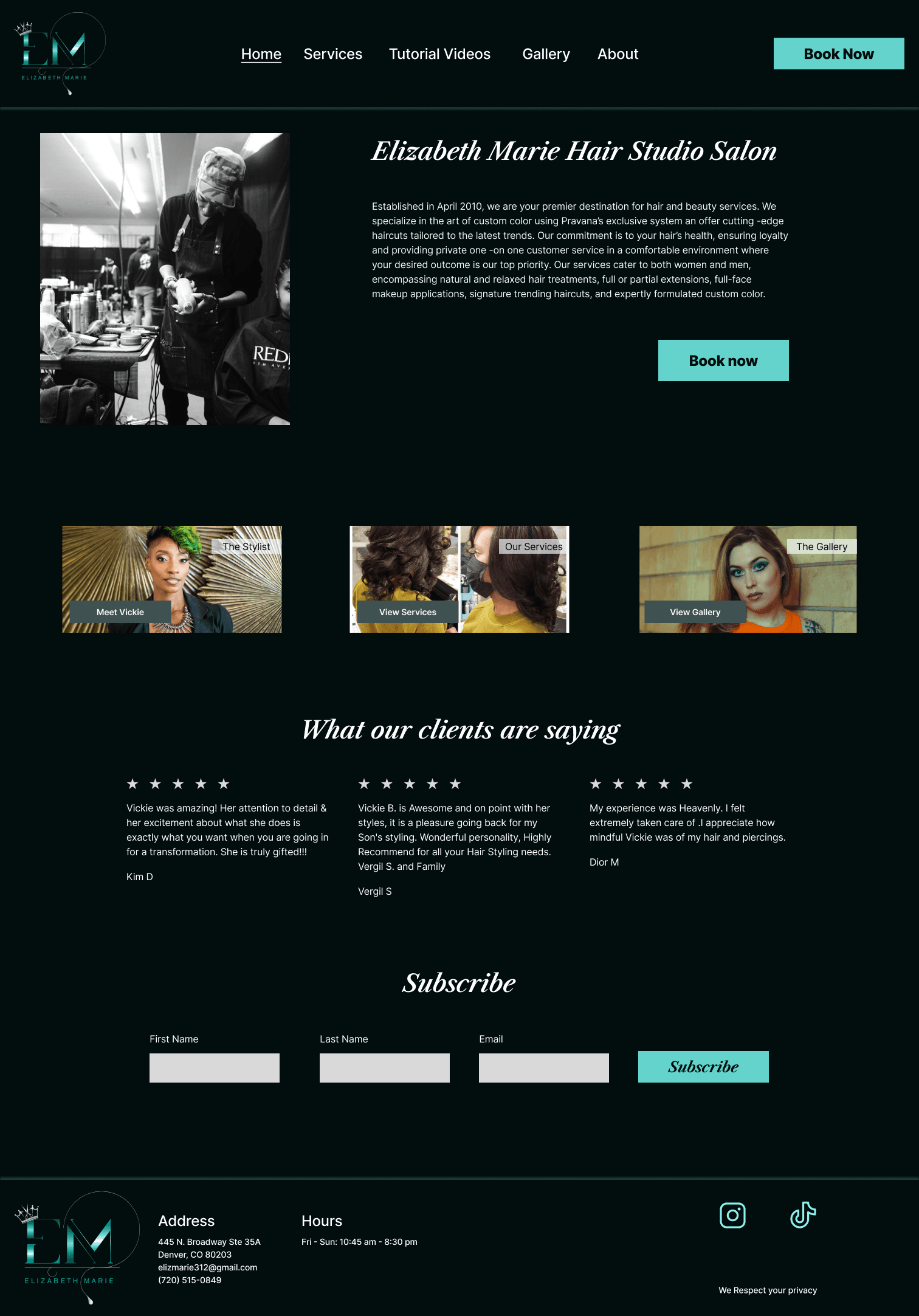
I updated the homepage to have a different picture so it didnt make people feel weird when they navigated to it
I increased the text size for the paragraphs and reviews so that it was easier for everyone to read
The top navigation bar on all pages increased in size so that the logo could be bigger and more easily seen
For both desktop and mobile I minimized the confusion by updating the gallery page so that it did not have the word ‘service’ on it in inappropriate places
Version 1
Version 2

Version 1

Version 2

Learnings & next steps
Learnings & next steps
Key learnings
Key learnings
I learned about independent client work and making decisions on your own that would be helpful for the user while keeping in mind business needs
The biggest challenge that I faced was the unavailability of my client to discuss each step in the process. Ultimately, she trusted me to complete the designs on my own and present her with the final product
I learned that it is impossible to address every person’s piece of feedback but it is important to recognize patterns and address the major topics mentioned in testing and interviews
I also learned about WCAG guidelines especially when it came to the logo. There was really nothing I could do about the logo as that is what the client has been using for a while, but I learned that logos do not have to be accessible under WCAG guidelines and was able to focus my efforts on improving other aspects of the site
Next steps
Next steps
Talk more with the client about anything that she thinks is lacking and could optimize her site
Figure out a more visible way to display the side to side services menu
Come up with a light mode version of the designs so that it can match people’s browser preferences
Add the other pages that the client already has on her current website
Get in touch at emma.tulsky@gmail.com
©2024 Emma Tulsky, All rights reserved
Get in touch at emma.tulsky@gmail.com
©2024 Emma Tulsky, All rights reserved
Get in touch at emma.tulsky@gmail.com
©2024 Emma Tulsky, All rights reserved
